Year
2021
2021
Scope of work
User Interface, User Experience,
Traffic data analyses
Duration
3 months
Client
Canopus
Canopus
A redesigned experience for Canopus, a leading real estate agency
This project was developed for Canopus, a leading real estate agency specialising in the development, construction, and sale of commercial and residential properties in Brazil. With operations in 10 Brazilian states and the Federal District, the company has successfully delivered over 25,000 units in its 50-year history and is recognized for its commitment to meeting deadlines and delivering high-quality projects.
Our focus was on redesigning their website to enhance usability, improve user experience, and increase the conversion rate of visitors into qualified leads through more concise and organised information
Working with a cross-functional team, I led every phase of the project, from data analyses, discovery (problem definition) and the ideation process to the creation of the final user interface.
First things first
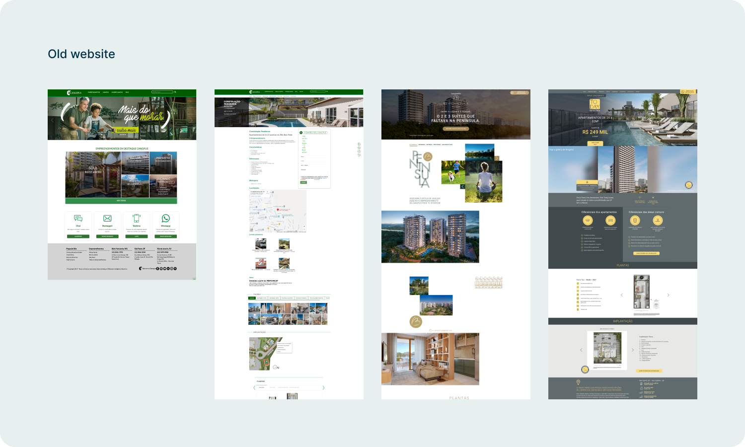
The first step was to identify the issues. For the Discovery phase, we engaged with stakeholders, conducted benchmarking, and analyzed the old website using data from Google Analytics and Hotjar. Stakeholders consistently mentioned that the website felt outdated, but I needed deeper insights to generate better recommendation.
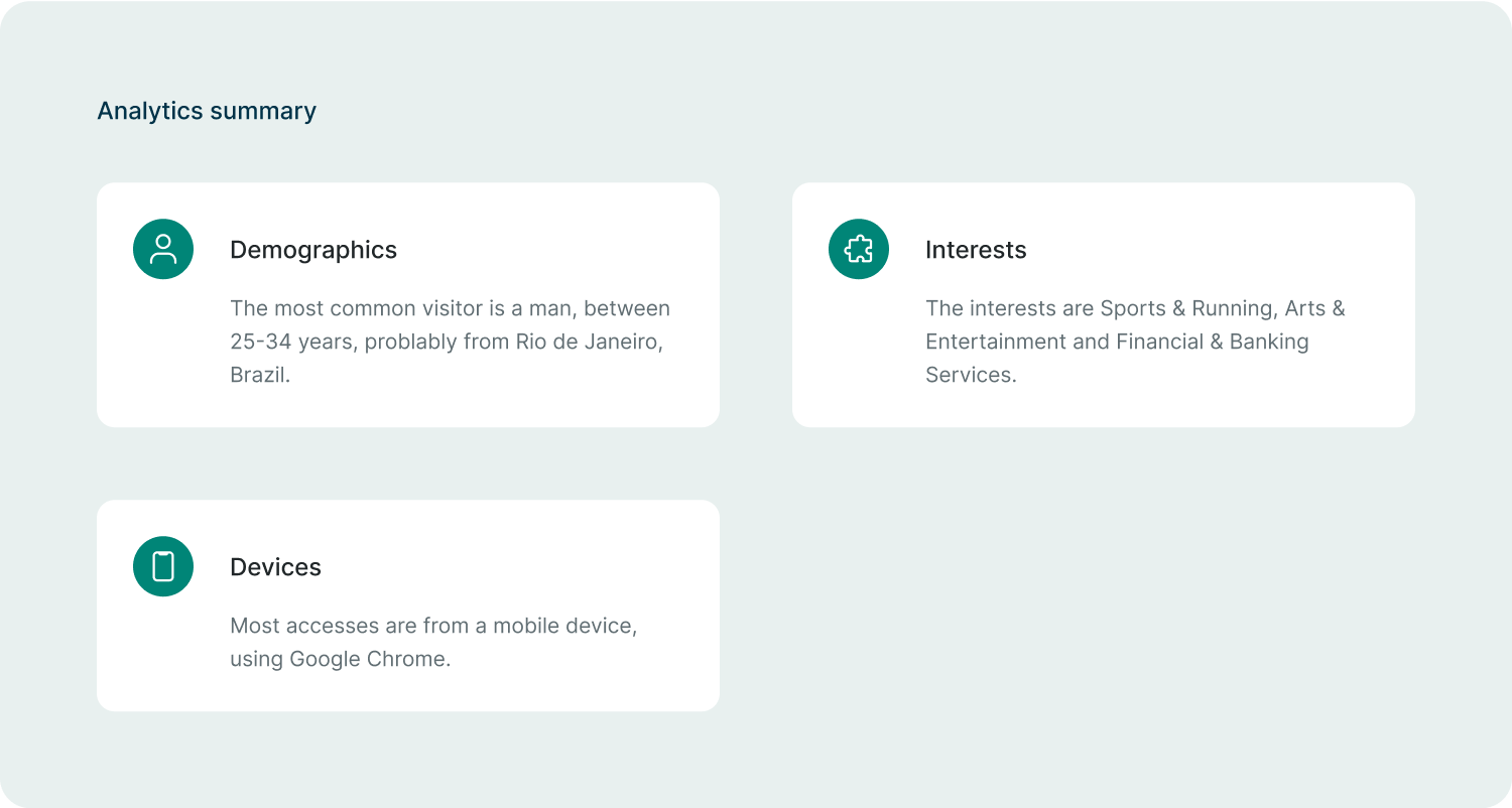
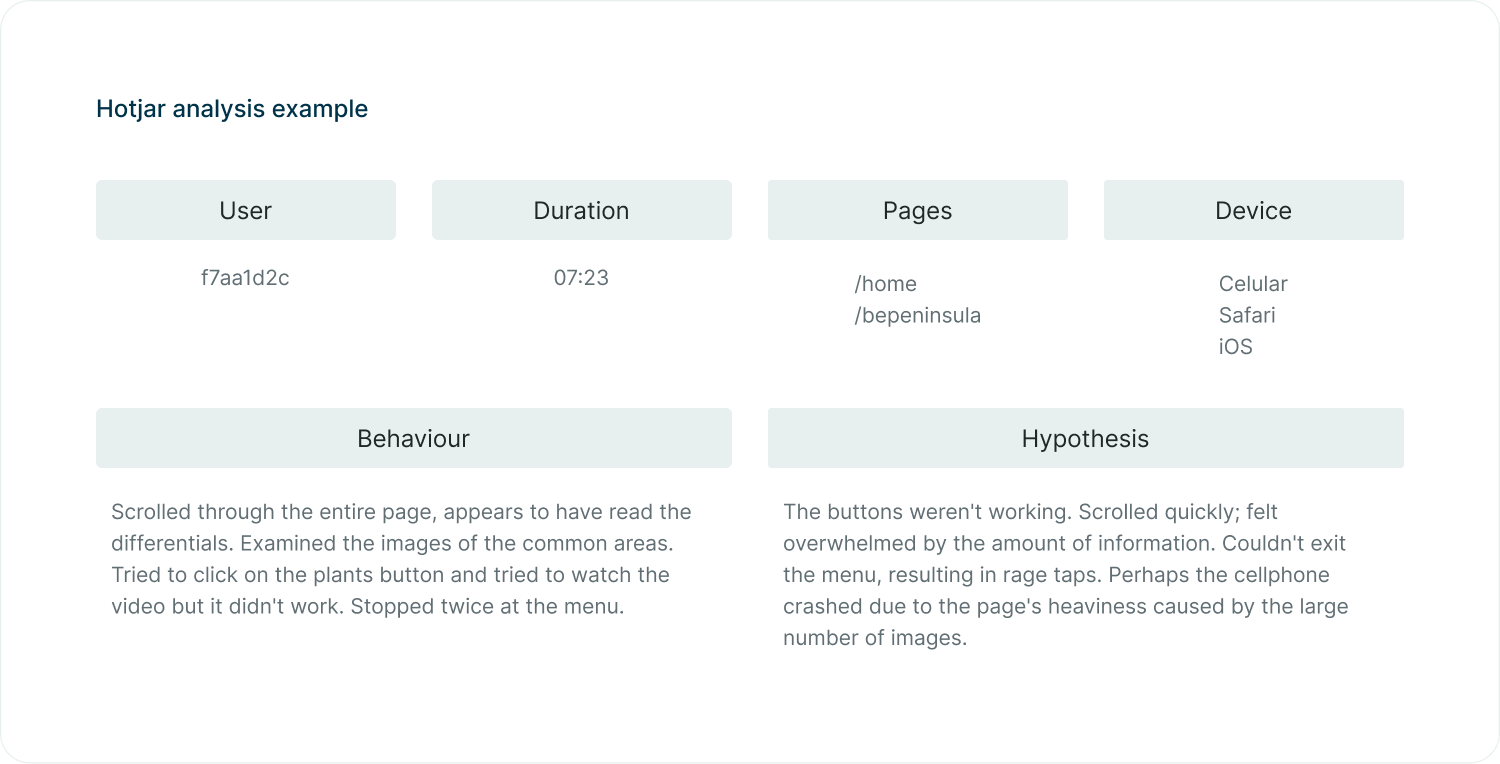
Initially, I analysed data from Google Analytics to comprehend demographic, behavioral, and device-related information. Then, I examined over 20 user session recordings and the heatmap of the main pages on Hotjar to empathize with our users, understand their behavior, and generate hypotheses. This served as a hybrid quantitative/qualitative research approach, helping identify user pain points, opportunities, user patterns, and insights. Key competitors were also analysed to understand their innovative approaches.
New goals
Once I collected and summarised all data and defined the main issues, I started comparing the previous hypothesis with critical problems uncovered.
The main goal of the redesign was to optimize the user experience, enhancing the usability of the website and, consequently, increasing the conversion rate of visitors into qualified leads.
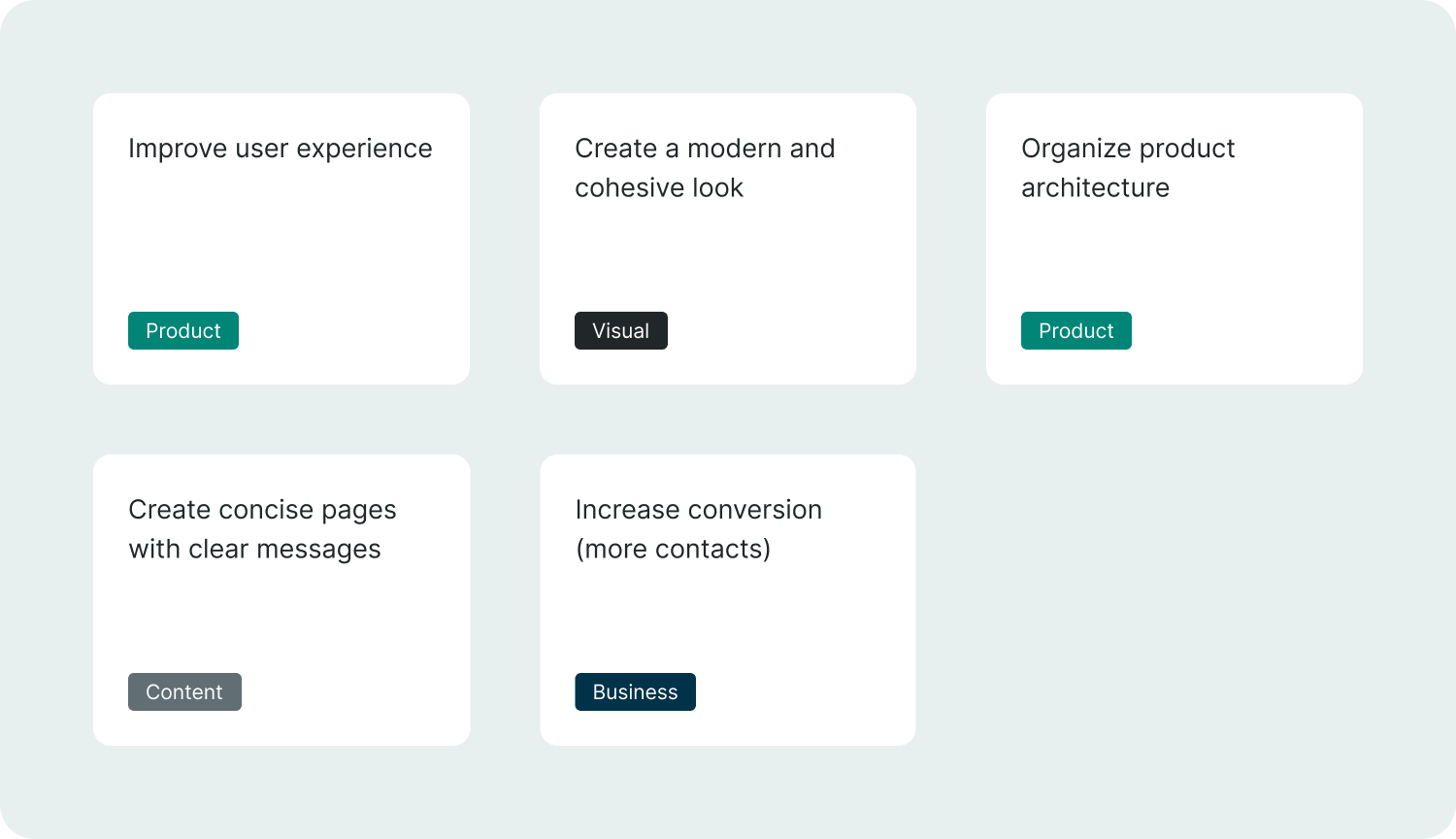
Problems & solutions
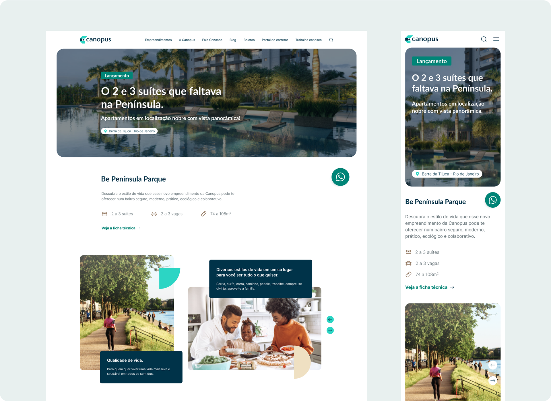
P: The old website had many pages with different layouts and styles of design.
S: I created new visuals, where components and pages have a cohesive layout and follow a consistent design pattern.
————————————
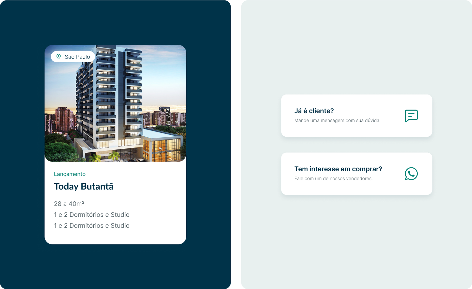
P: Product pages had excessive information, leading users to leave without reading.
S: More concise and organised information.
—————————————
P: The old website was confusing and hard to navigate.
S: We reorganised the menu for clear and objective navigation.
—————————————
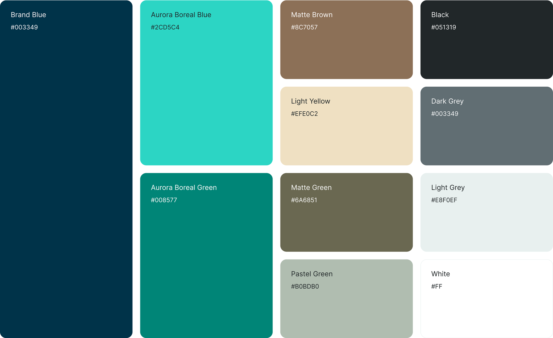
P: The visual was very outdated.
S: As part of a brand rebranding, we updated the colors (with accessibility in mind) and created a more modern and consistent look.
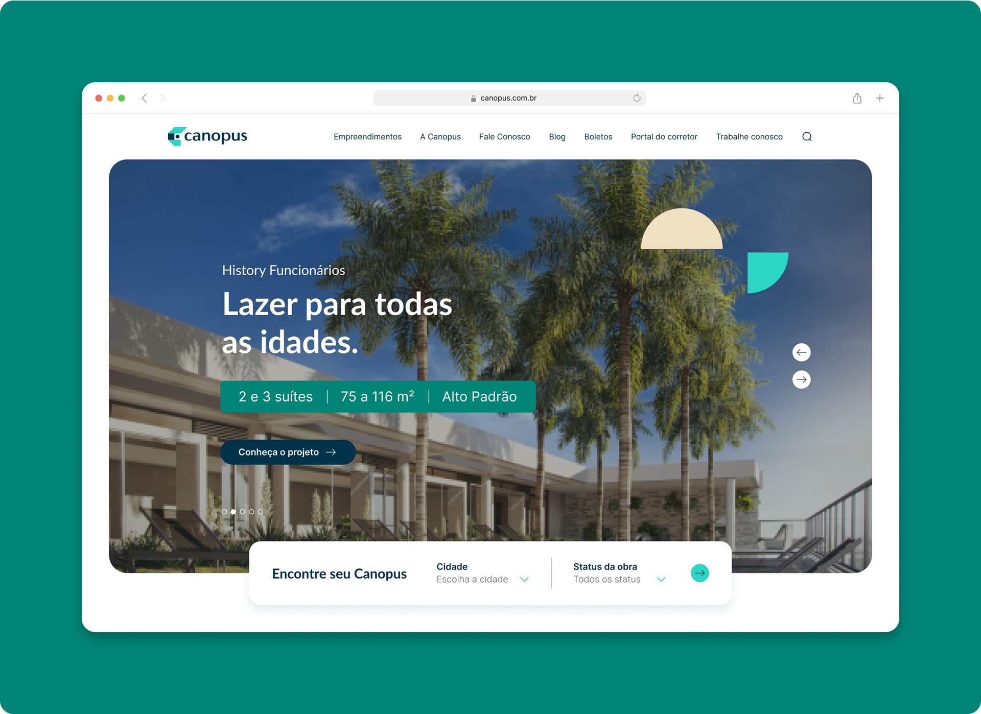
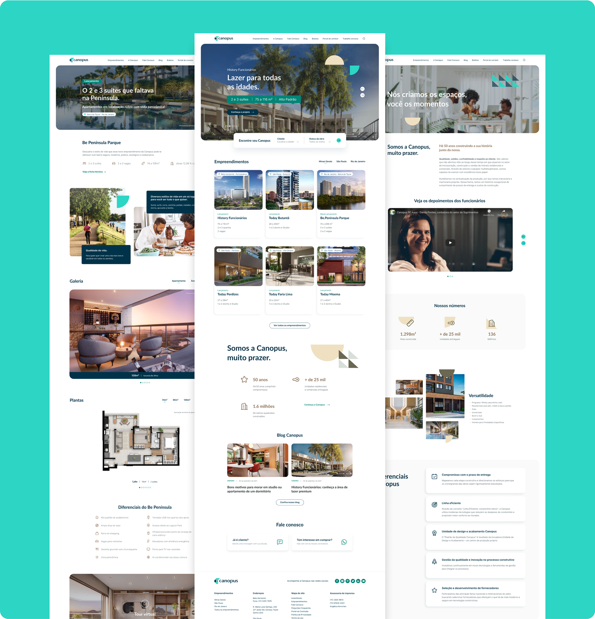
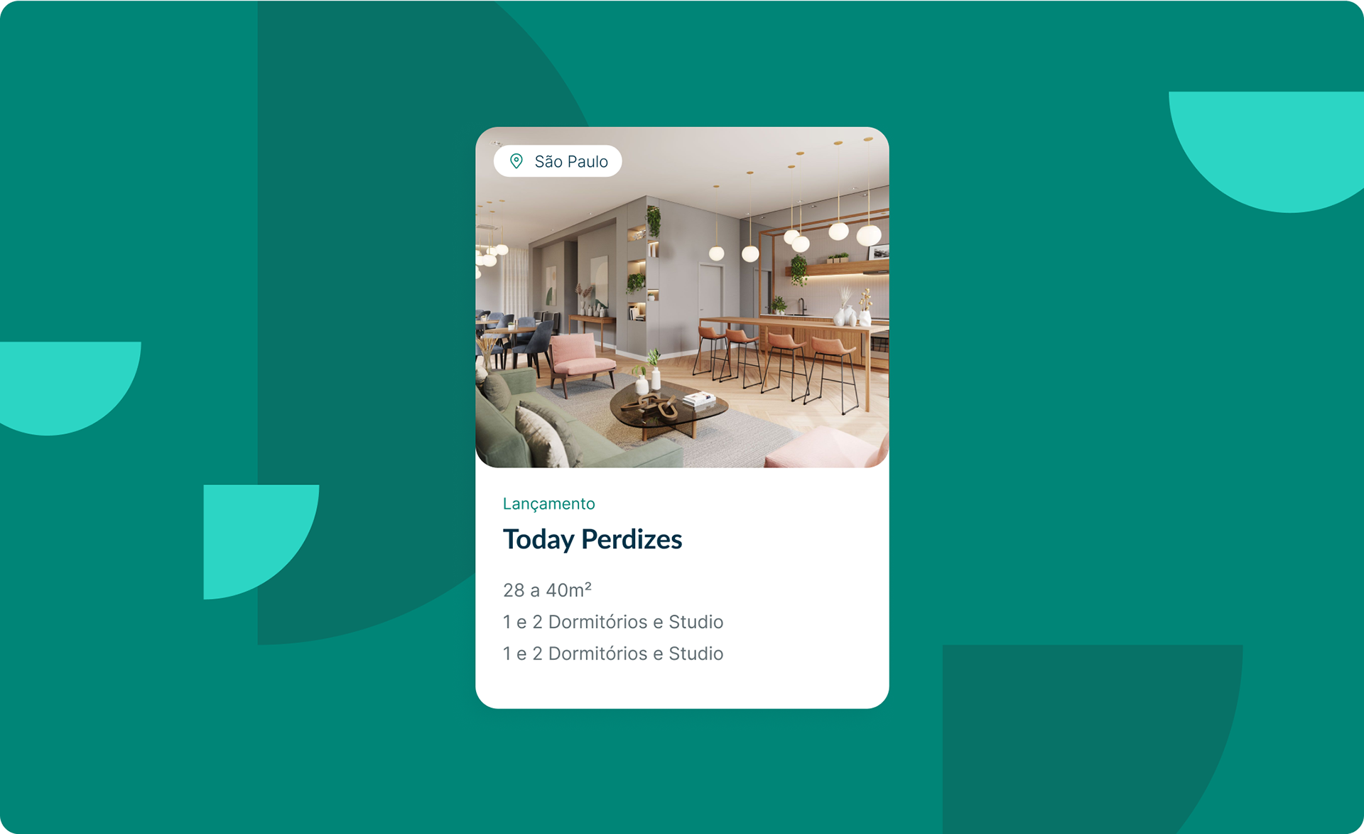
New visuals
With the key issues defined, it was time to start working on concepts and potential visual solutions.
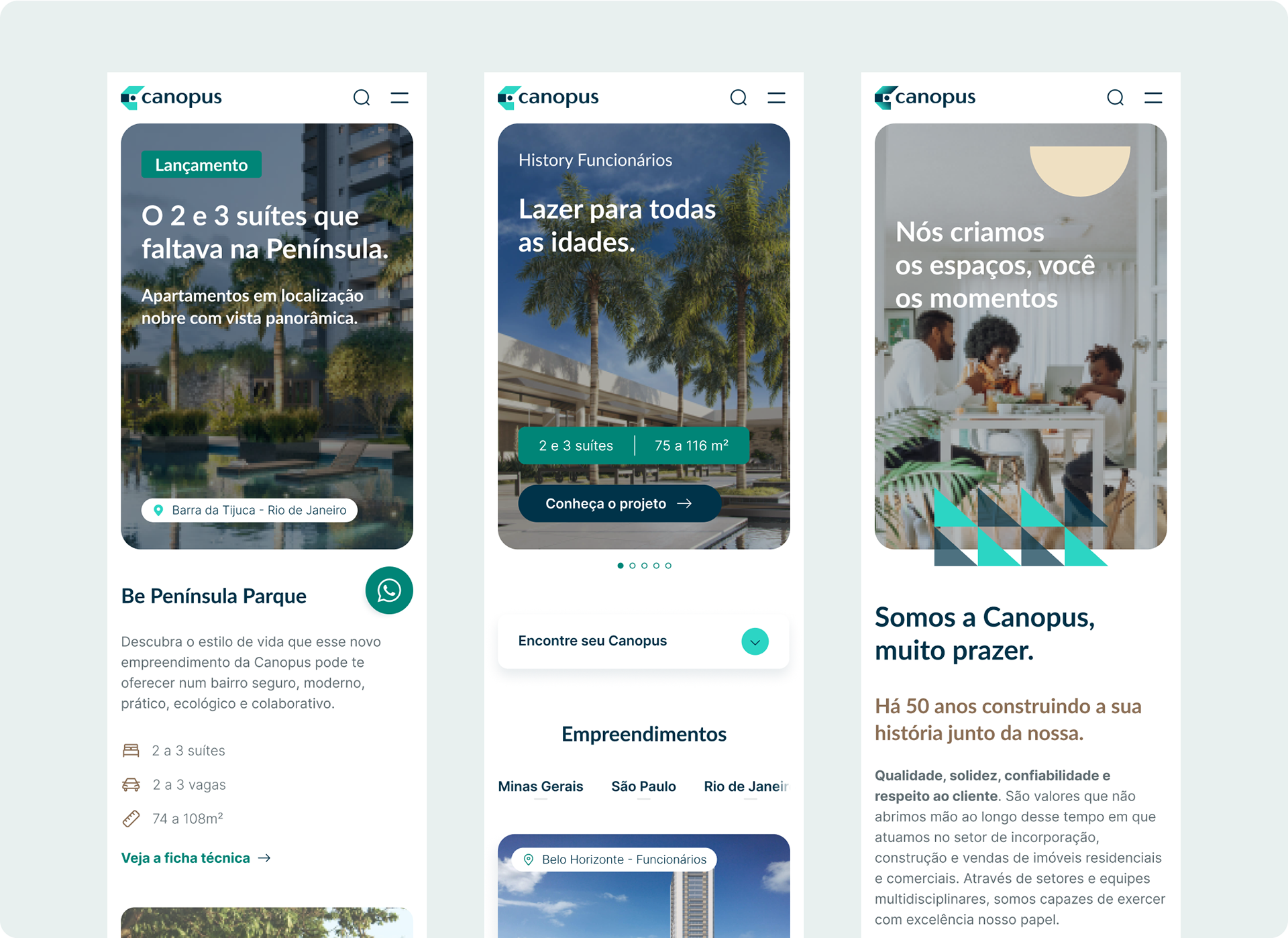
I designed over 20 screens, incorporating continuous feedback from the Canopus team throughout the process. The entire project took approximately three months to complete. While we adopted a mobile-first approach, I ensured that all designs were also optimised for desktop viewing.
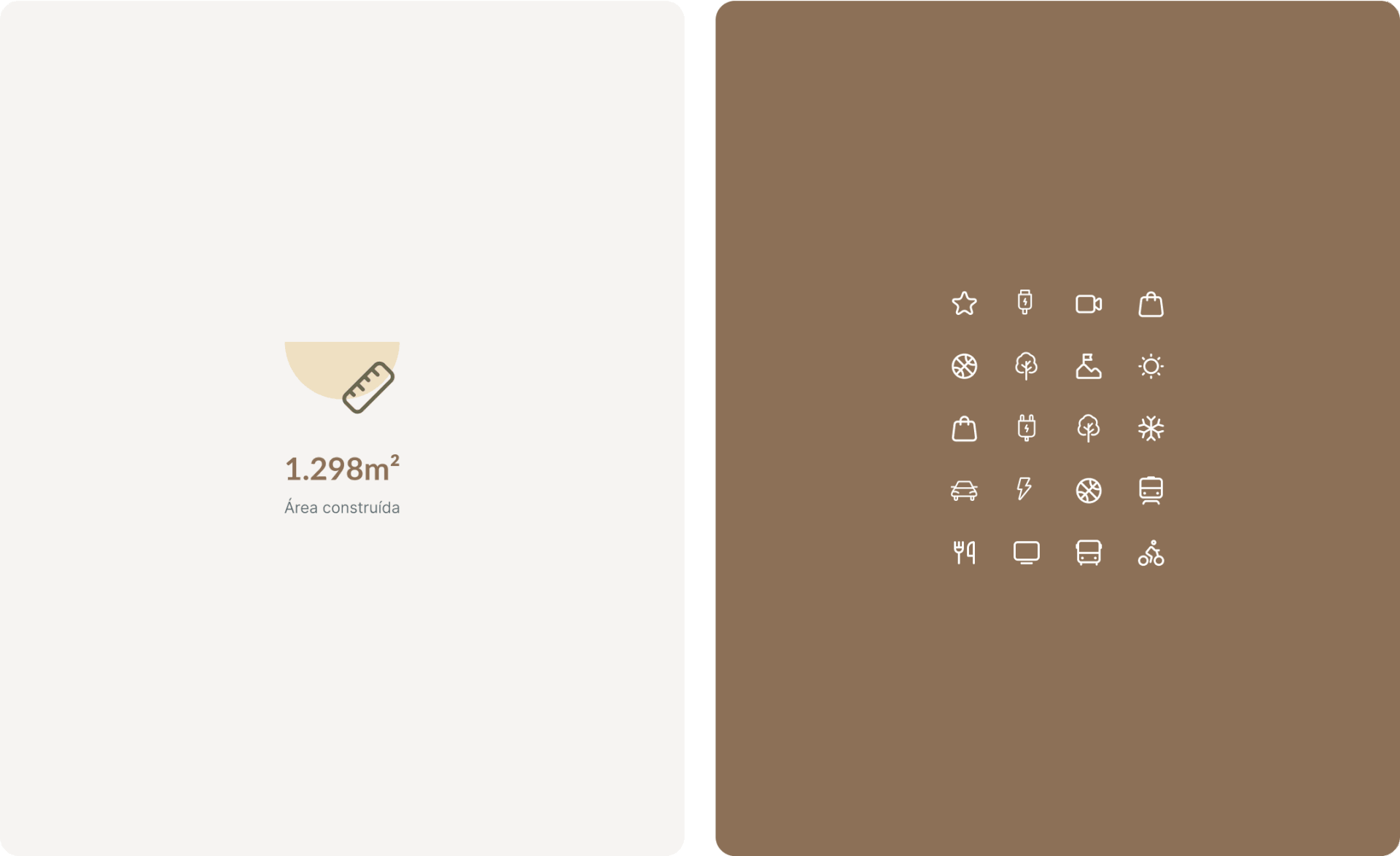
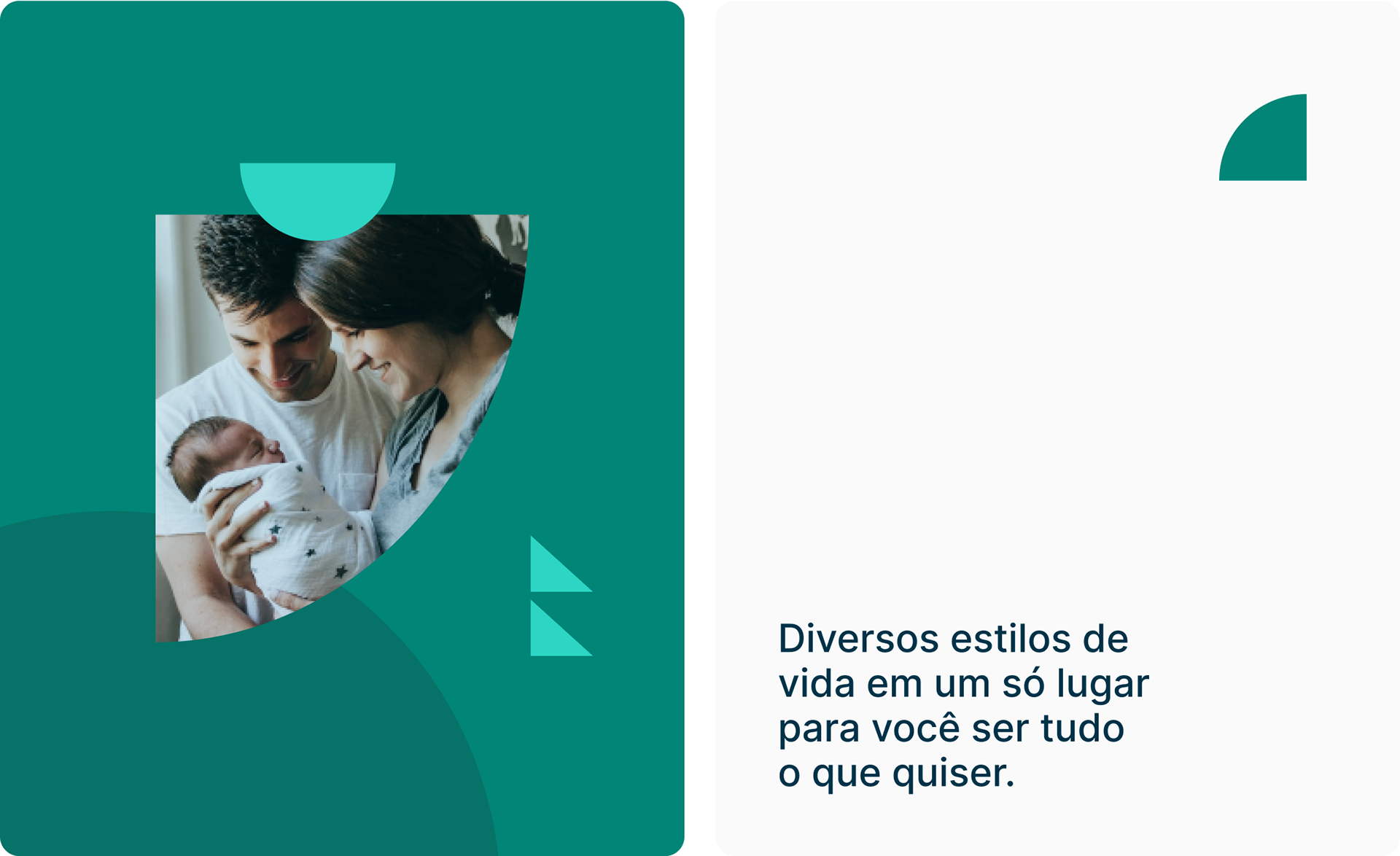
For the new visual, I focused on a clean and modern layout, with more white space, less text and organised content to enhance user comfort. To add dynamism, we complemented the text with illustrative icons and highlighted brand elements throughout the layout.
We created visual hierarchy through typography, playing with sizes and weights. We chose Lato for headings and Inter for body text.